Before starting any initial designs, I have researched into editorial spreads to get more ideas and more of an in depth understanding of what makes a successful magazine spread.


I have looked into various editorial designs to get some inspiration for my initial designs, I looked at a variety ranging from black and white versions and very colourful versions. Alot of the outcomes I have researched have alot of type layered onto imagery which I think works exceptionally well as it gives contrast when using a contrasting colour against an image, this is what makes the reader want to read the editorial but also to catch their attention which is vital and is what I need to keep in mind as I want the readers to read my spread about Blood Diamonds as not many people know that this is happening in certain parts of the world.
Having a set colour palette is also an important factor as I was researching into these layouts as having too many colours in an editorial can put off the reader as it will look too busy but also clash with other aspects such as imagery and body copy.
Looking at these editorial outcomes, some do have a page where it is just an image with some body copy or heading and I think this works well as it breaks up the pages with alot of body copy on it which gives the reader a break from this but also to look and absorb what the image is and what message it is portraying.
Research is a vital aspect within a Graphic Designers practice. Design research plays an important role in discovering design solutions that meet business objectives. The evolution of technology, openness of the Internet makes this very easy to search up information effectively and quickly to generate ideas for clients etc.
INITIAL IDEAS
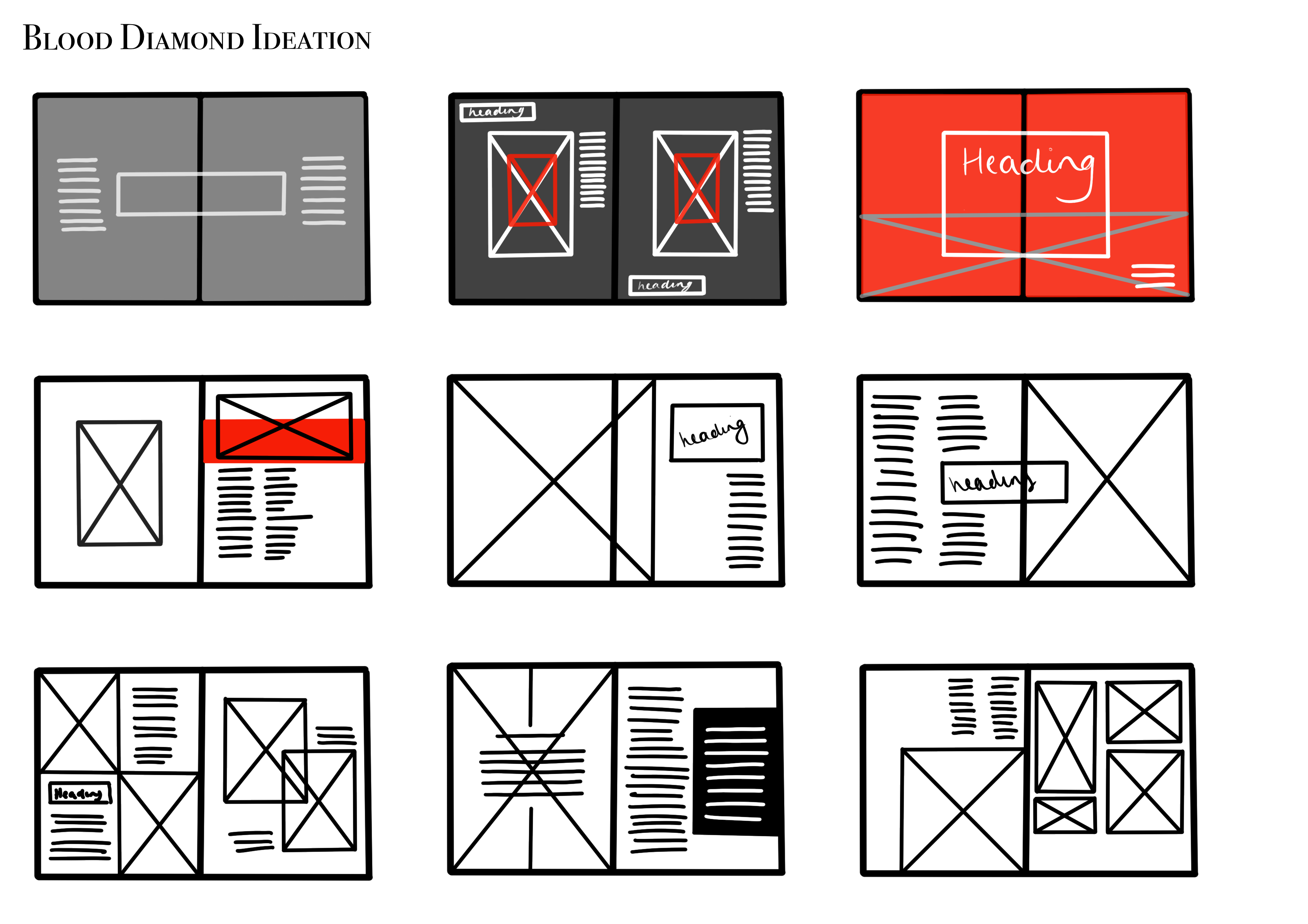
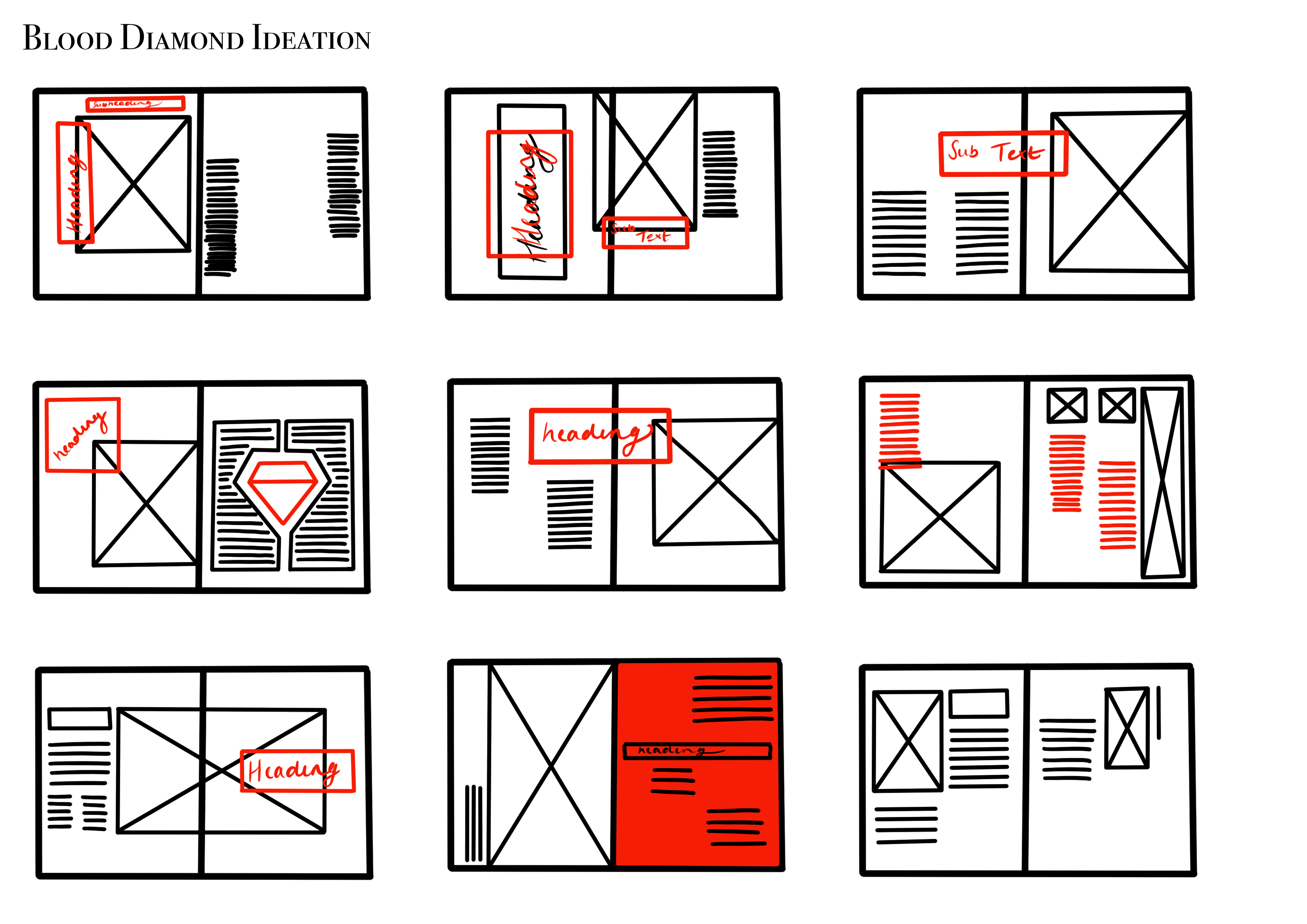
From the research I have generated some initial editorial ideas.


As you can see, I have experimented with a wide variety of layouts, showcasing hierarchy, placements of imagery and body copy and using a limited colour palette to ensure certain aspects do not clash with one another.
