


graphics
Taking the advice I received from David, I changed the name to something completely different using my native language Afrikaans. The brand names I had were – CONFLIK – Conflict, BLOED – Blood, BLOED DIEMAMDT – Blood Diamond and lastly, GELWELD – Violence. In the end, I decided to go with GELWELD – Violence as this is what Blood Diamond cause in all different countries who are known to mine and distribute them to well known jewelers around the world.

I used a Serif typeface on my Procreate app to create the first possible logo and taking inspiration from the BELMACZ logo to fill in certain letters with a visual but I would rather express more individuality. I want the viewer to question why, who, what etc, asking themselves what does this mean and what is the meaning behind this brand name and visual.
I then created my own typeface using more of a more modern and contemporary style to it which I think works well in itself, I used the map view of the countries Sierra Leone, Republic of Congo and Zimbabwe as the template and from this created a typeface.


Belmacz opened its first shop and gallery in London Mayfair. Mind Design have re-designed the original identity and worked in collaboration with Jump Studios on the interior.
The new Belmacz identity relates to the process in which raw minerals and diamonds are more and more refined until they become a piece of jewellery. Mining is a brutal intervention with the environment where often massive holes are ‘cut out’ of the earth. The conditions under which people work in mines for example in Africa or Siberia are hard and their life could not be more different from that of the rich clientele shopping in Mayfair.
Between Siberia and Mayfair the materials go through many hands. We also wanted to visualize this idea of dislocation. Not only the raw materials travel also the final pieces of jewellery often start a new journey. They are passed on from one generation to the next, given away as presents, get stolen or auctioned, and so on.
For this reason the new Belmacz identity works across many different items and media. Every shape that has been cut out on one item re-appears again somewhere else. For example, a shape missing on a business card can re-appear on a carrier bag or somewhere in the shop interior. It was a difficult task to keep track of all the shapes within the overall design.
Information sourced from – http://www.minddesign.co.uk/show.php?id=380&pos=6&cat=2


This has given me more inspiration for my own packaging and logo as I came up with the idea of looking at a map view of the countries who are known to mine blood diamonds and out this onto the packaging as I feel this could be quite striking and will also have a hidden agenda behind it which will make people question what it is.
After discussing with David about the critic odyssey logos he suggested that I look at a link of a jewellery brand called Belmacz Gallery to get further inspiration for a more contemporary logo and packaging idea, as this gallery relates and it’s almost similar to what I am trying to convey and portray to the public.
Another tip David gave me was to change the name of the project should be more mysterious and make people question what it is actually about, so he suggested that I use my South African nationality and my native language Afrikaans to create a more unique mysterious name with a hidden message behind it which will work much more.
From the feedback I received from Theo and Carol, I started off with redesigning and developing the logo, I started to focus on something simplistic just of a coloured field diamond and from this develop into a more linear diamond experimenting with different shapes and angles of this. I also started to experiment more with typography, using a serif typefaces and a mixture of my own typefaces I created using the black and red colourway to represent the blood diamond.
I also tried using a geometric approach and the typeface within a diamond shape to see how that would look, in some regards, some logos look more polished than others but to see what logo would work best, I will be discussing this with my tutor in my next tutorial to get some advice and feedback on the matter.

Taking the feedback forward, I will develop all aspects mentioned by my tutors to create a more cohesive and refined outcome. The logo is mainly the part I need to focus on.
These are my final outcomes for this project. I created an editorial spread to be placed in any magazine and also jewelry packaging to showcase blood diamond with aspects coming from the conflicted diamond minds in certain parts of Africa.
EDITORIAL


I experimented with a variety of imagery ranging from shocking imagery such as diamonds in blood to less shocking imagery to show the devastation of what these blood diamonds are doing to the people in certain parts of Africa. Experimented with hierarchy, making certain parts more noticeable than others so the reader can see specific parts of information.
I used two different types of typography, a more refined type to represent the lux of diamond and another to represent war and conflict of diamonds which I think works well as it gives a sense of contrast through out the editorial.
PACKAGING


I created this packaging to showcase that some jewelers still use blood diamonds to create there jewelry, so I wanted to use the colour aspect of blood and use a variation of red to great depth in the diamond. It represents the lives lost and the large amount of blood shed that has happened, so used a teardrop shaped diamond to show an abstract version of a blood drop. The typeface I created myself as I wanted to have a contrasting typeface to show the luscious aspect of the diamond.
What would come in the Gift Bag:
All in all, I really enjoyed this project as it enabled me to base a project I am interested in and basically be creatively free to do and design what I wanted to do as a whole which is refreshing as it is not often you are able to do a project based on something you are interested as a whole. As a graphic designer, you are given briefs to follow and create outcomes for those said briefs clients.
From the initial ideas I created, I wanted to develop them even further to show growth and development from the start where I was creating rough sketches of possible ideas for this project.
EDITORIAL

Taking different aspects such as layout ideas, body copy etc from the research I carried out and developing from initial ideas, this is my final idea for my editorial.
PACKAGING
For the packaging ideas, I developed my ideas even further, experimenting with different shapes and colours to different typefaces I created from scratch to see what different variations I could created to fit with the theme of blood diamond. Then showing the different ways these wpuld look on packaging such as a bag, ring boxes etc.


This gives myself the perspective of what the strongest outcomes would look like on mock up packaging I drew myself.


From the initial ideas I created, I wanted to develop them even further to show growth and development from the start where I was creating rough sketches of possible ideas for this project.
This is a mock up of the jewelry packaging to showcase what it would look like in perspective, I tried these out with two different design ideas to see what it would look like. Personally, I don’t think these two work for the packaging as it is quite bulky and not as clean as some jewelry brands I have researched into.
PACKAGING
For the packaging ideas, I developed my ideas even further, experimenting with different shapes and colours to different typefaces I created from scratch to see what different variations I could created to fit with the theme of blood diamond. Then showing the different ways these wpuld look on packaging such as a bag, ring boxes etc.
As one of my ideas is to create jewelry packaging but also implementing the blood diamond aspect. I researched into various well known jewelry business to look into there packaging.


All the pakcaging is similar in some regards but all have there own uniqueness which relates to there brand and brand aesthetics which I think is very important for customers to see as they will be able to easily recognise what brand you have bought from etc.
All the packaging has its own unique colour theory and typeface which is placed where it is easily legible no matter the size of the typeface.
Very simplistic in design which I think is the best way to go as having packaging that is too cluttered will be off putting so taking this forward, I will most certainly take the simplistic approach into my ideation, sometimes less is more.
Before starting any initial designs, I have researched into editorial spreads to get more ideas and more of an in depth understanding of what makes a successful magazine spread.


I have looked into various editorial designs to get some inspiration for my initial designs, I looked at a variety ranging from black and white versions and very colourful versions. Alot of the outcomes I have researched have alot of type layered onto imagery which I think works exceptionally well as it gives contrast when using a contrasting colour against an image, this is what makes the reader want to read the editorial but also to catch their attention which is vital and is what I need to keep in mind as I want the readers to read my spread about Blood Diamonds as not many people know that this is happening in certain parts of the world.
Having a set colour palette is also an important factor as I was researching into these layouts as having too many colours in an editorial can put off the reader as it will look too busy but also clash with other aspects such as imagery and body copy.
Looking at these editorial outcomes, some do have a page where it is just an image with some body copy or heading and I think this works well as it breaks up the pages with alot of body copy on it which gives the reader a break from this but also to look and absorb what the image is and what message it is portraying.
Research is a vital aspect within a Graphic Designers practice. Design research plays an important role in discovering design solutions that meet business objectives. The evolution of technology, openness of the Internet makes this very easy to search up information effectively and quickly to generate ideas for clients etc.
INITIAL IDEAS
From the research I have generated some initial editorial ideas.
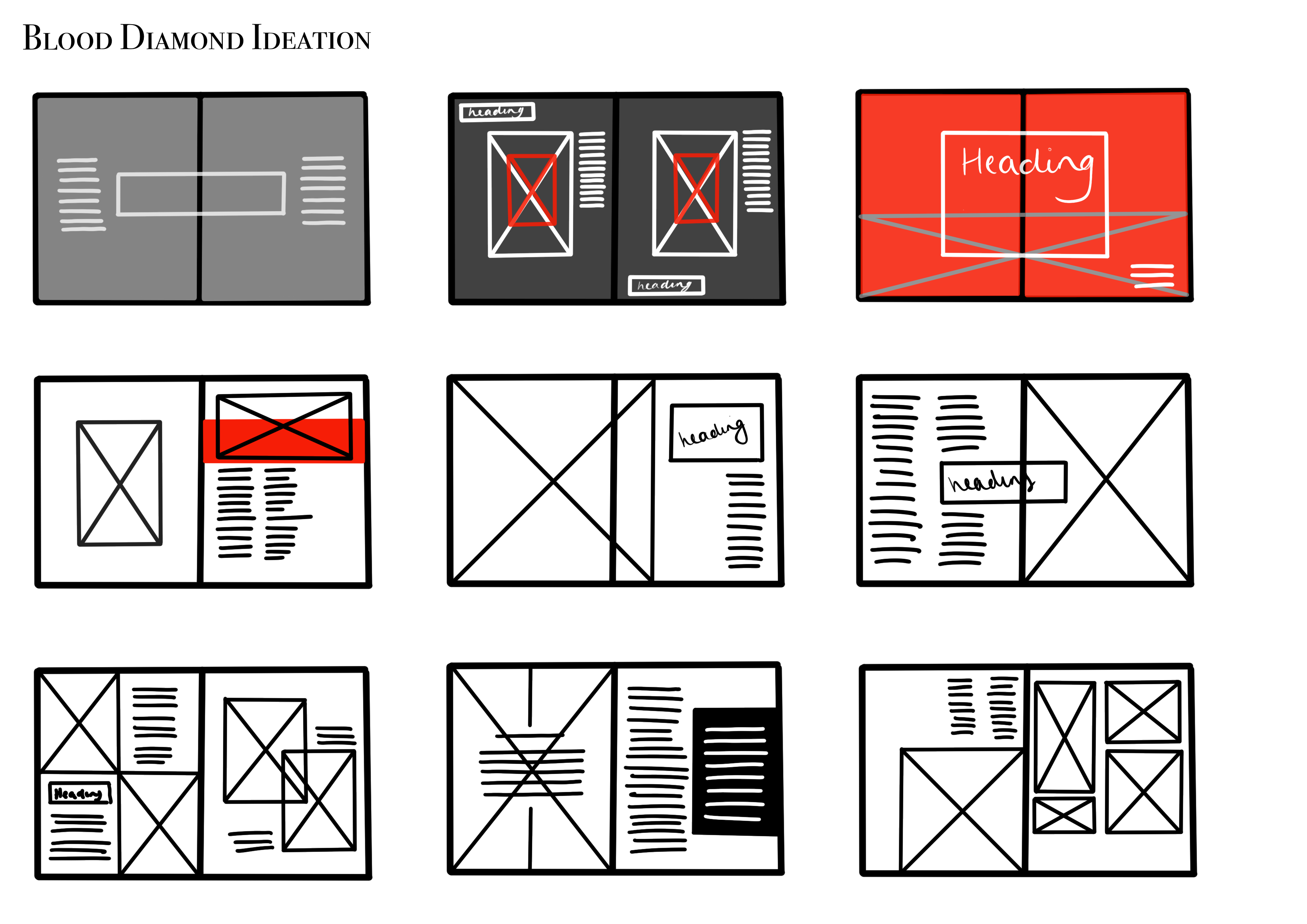
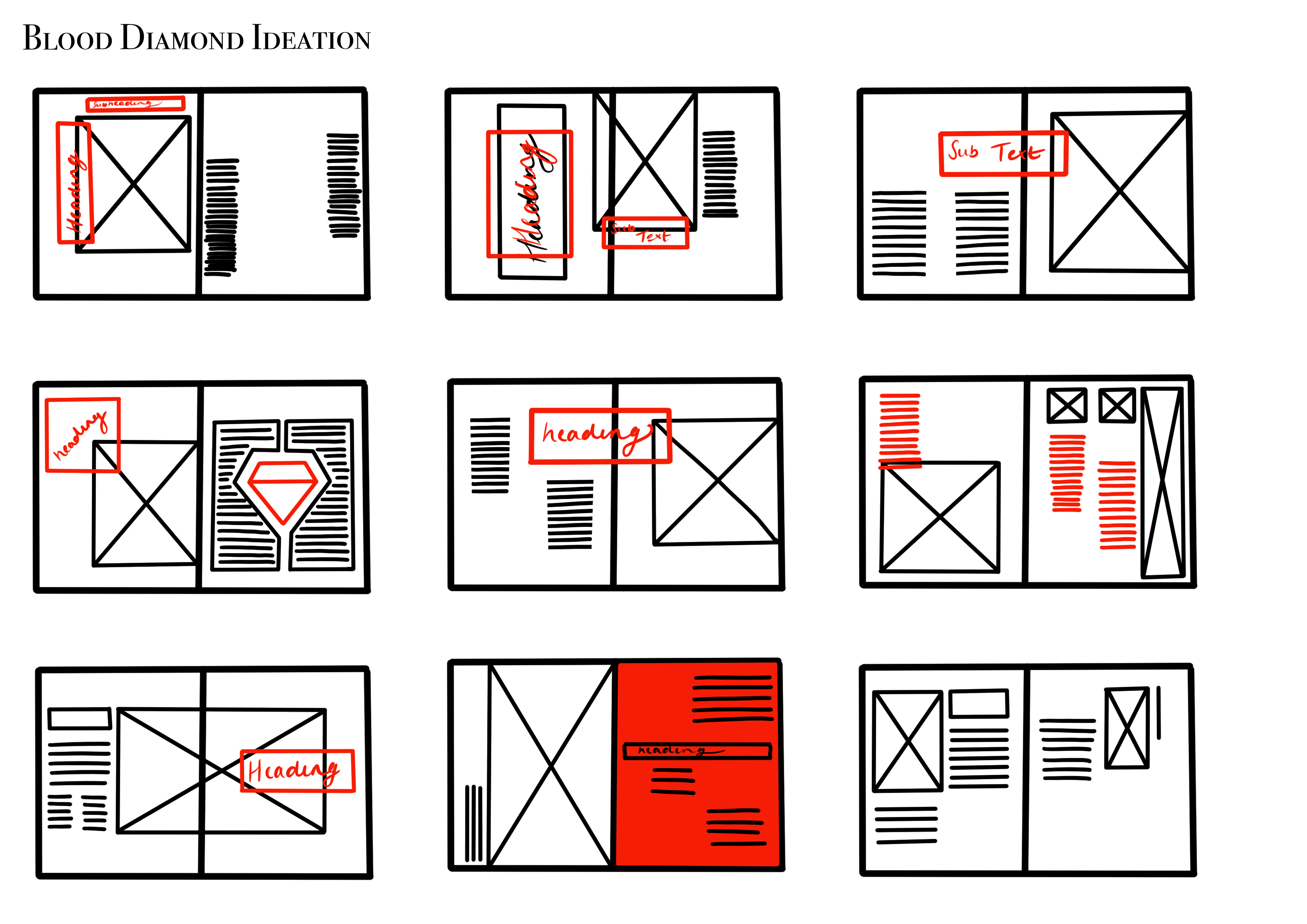
As you can see, I have experimented with a wide variety of layouts, showcasing hierarchy, placements of imagery and body copy and using a limited colour palette to ensure certain aspects do not clash with one another.
