BOOKLET


CARDS


POSTERS

SCRUM CAPS

graphics
BOOKLET
CARDS
POSTERS
SCRUM CAPS
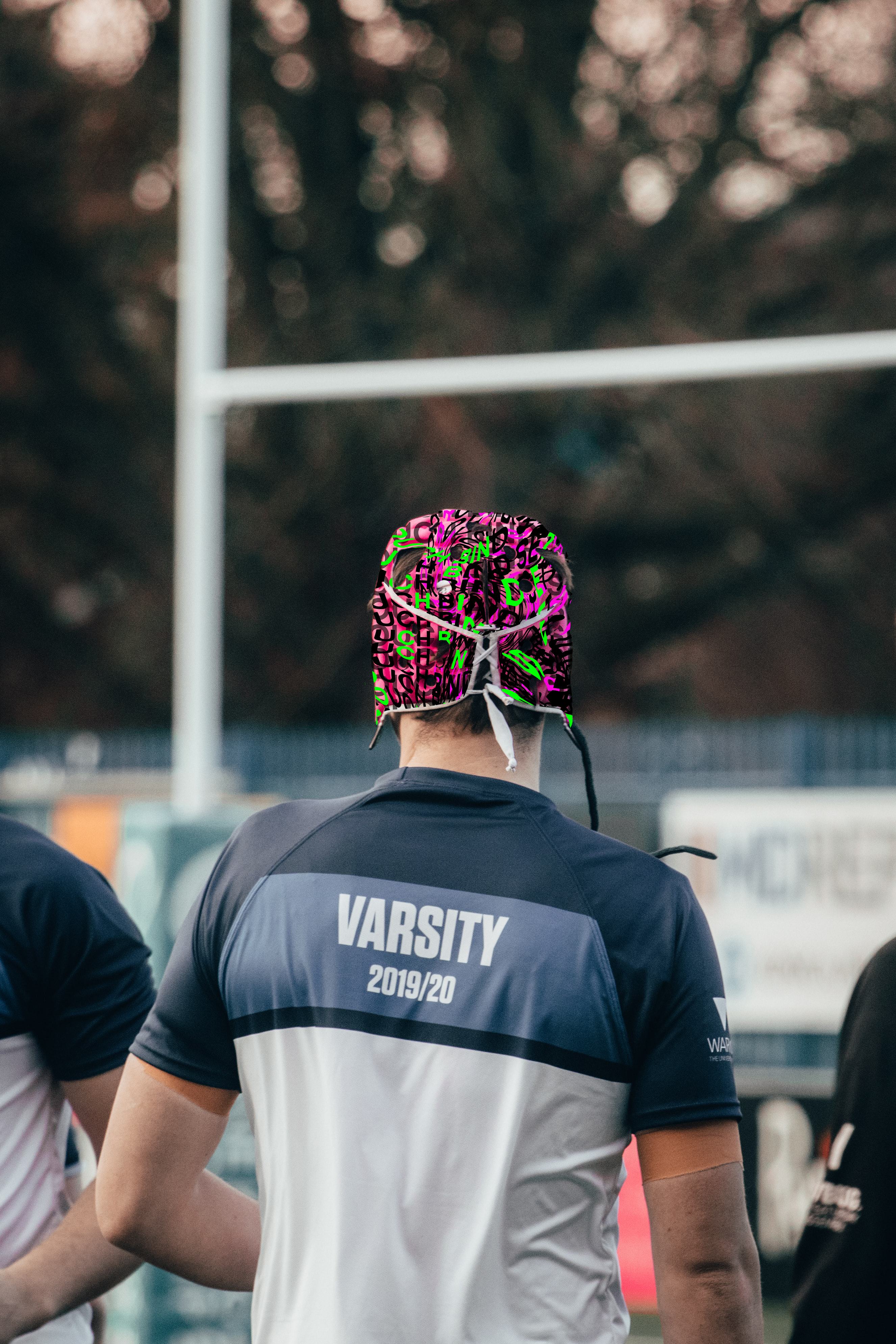
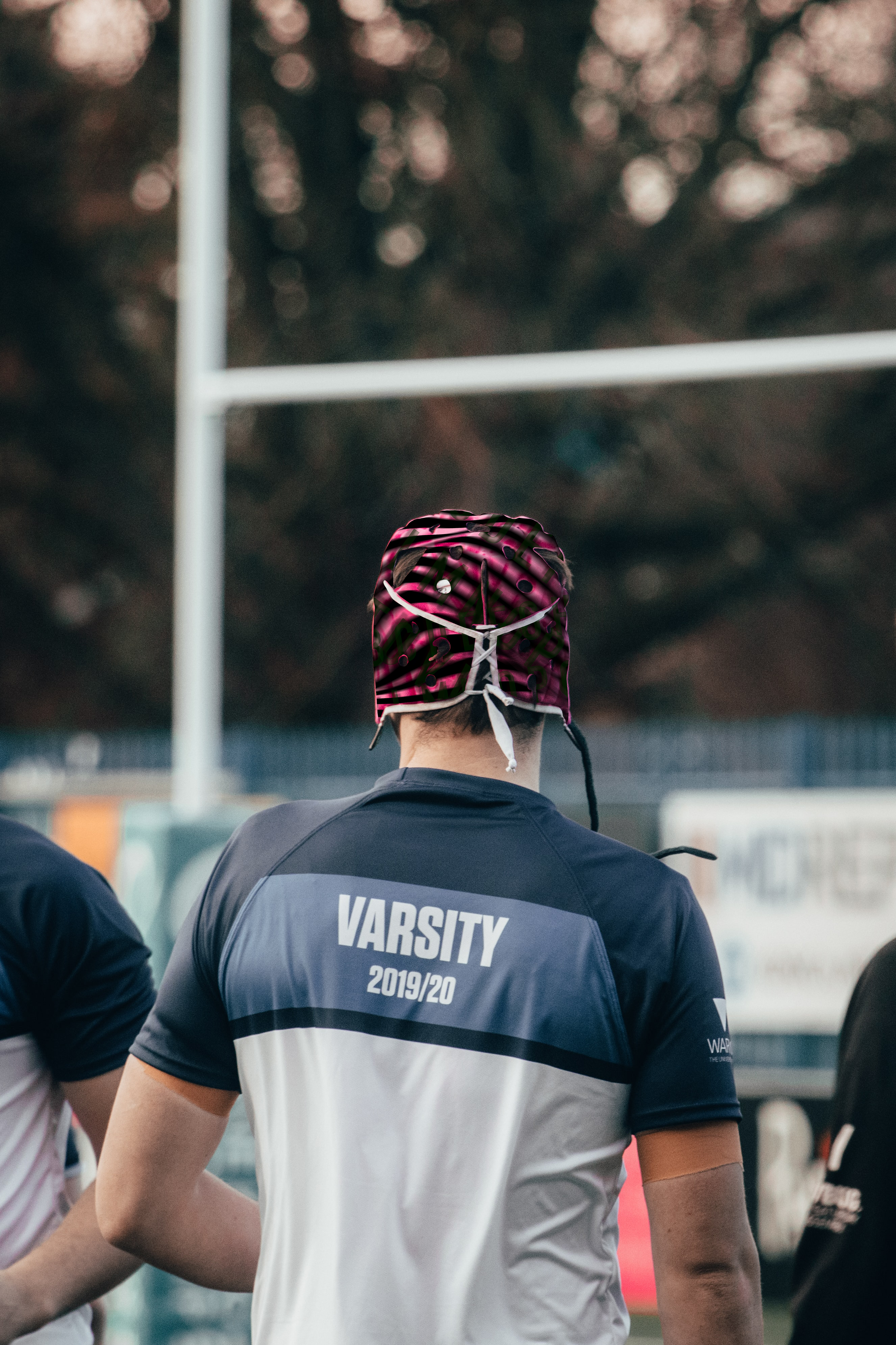
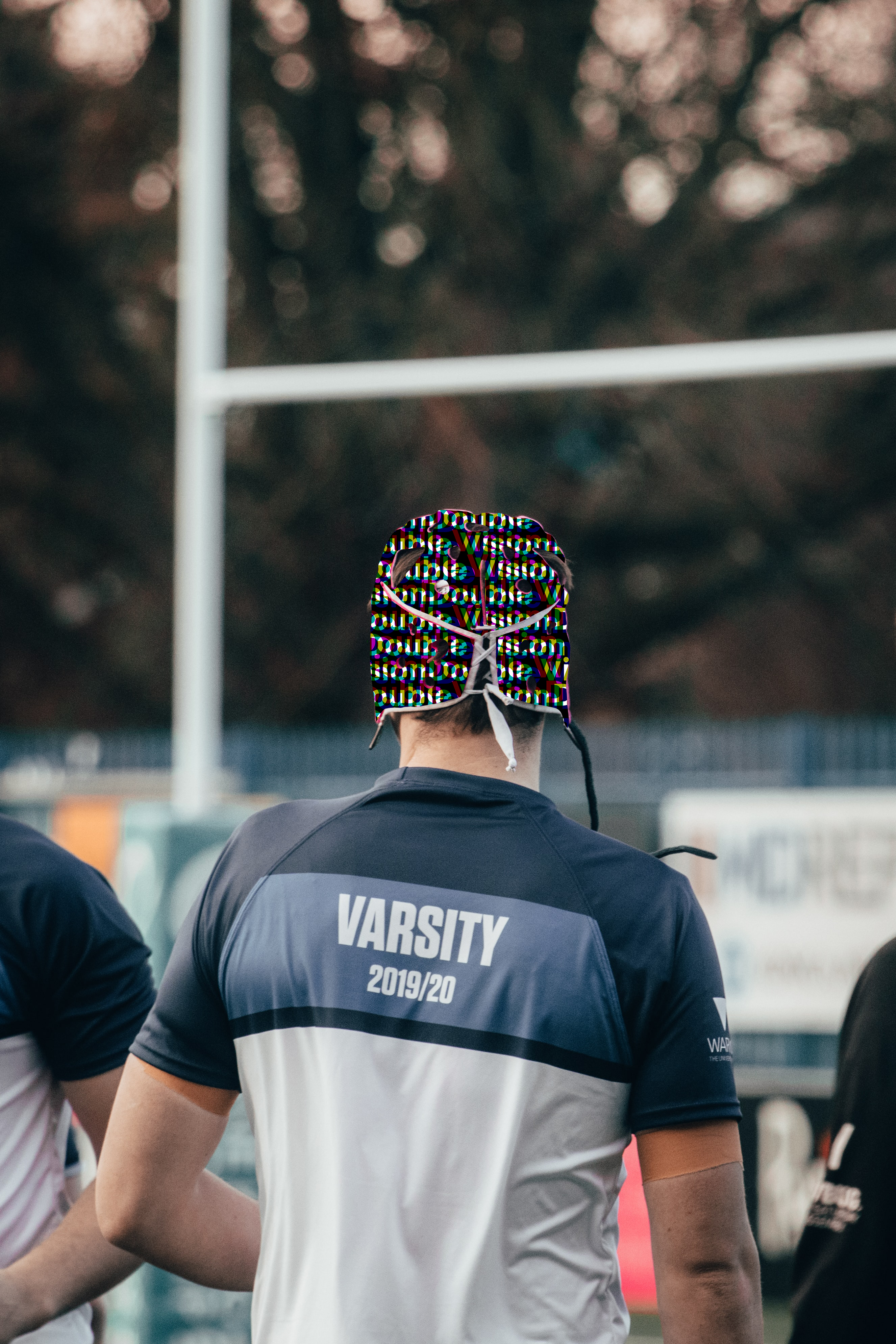
From my visuals I created for the cards to represent concussion symptoms in rugby players, I decided to use and carry that over to the scrum caps as I felt using these visuals would link better for the brand as a whole rather than creating entirely new and different visuals.

These symptom visuals will start to appear when a player has symptoms of a concussion which improves the safety of players when referees, coaches and ME’s notice these symptoms quicker to prevent further damage to the brain. The cards and this speculative idea can work hand in hand as coaches etc can identify what symptoms players are suffering in the moment.
Taking the advice from David he suggested I look at a website called typographicposters.com, 2 further inspire myself and create more ambitious ideation and outcomes for the posters aspects as my previous outcomes were lacking in these aspects. So I took inspiration from the posters I looked into and created more ambitious and developed ideas experimenting even further with layout and hierarchy.

These work more cohesively with the rest of my outcomes in regards to it being more contemporary and more ambitious.
From the advice received from David, I experimented with the logos three and six from the previous post and developed these even further using a variety of line weights and also the variety of colours I have used throughout this project – Black, white, green and pink.

After speaking to David, he suggested that I go with number three and six to develop even further using the Syn/ap/tic aspect which I think will create a stronger brand presence and identity for the viewer.

Thee are the various logo possibilities I came up with, varying with line weight and different heading placements and from this I decided to go with a logo with a black outline with a medium weight typeface to ensure the line weights of the logo didn’t clash.
Taking the advice from David in my previous tutorial discussing about logo is the most successful, I decided to develop 6 and 11 logos I have created as these were the strongest out of them all to develop even further to a finalized logo following the advice from David.

I will be able to experiment with lines and the chosen colours I have used through out to represent the brand aesthetic.
David suggested that I add a subheading to make sure the audience will know what the brand is about, and also experiment with the brand name – Syn/ap/tic, alternating in the colour black, pink and green.
After the tutorial with David, he suggested I look at the website typographicposter.com, to give me more ideas to further develop my posters and to further be more experimental with hierarchy and design aesthetic.
These posters are a mixture of posters I was drawn to, I came across a few posters created by various graphic designers – Neubad, est 2012/Luzern, Switzerland.
“I admire the graphic collective that originated around Neubad Luzern. The venue is often advertised with posters created by various graphic designers. These posters are very experimental and contemporary in their style …. right now, this is the place where the most up to date graphic design comes to life and way than you and bold visuals trends emerge.”


1st Poster – “Neubad Uber Wasser Halten”, 2021
2nd Poster – “Dessin Contemporain & Populaire”, 2011
3rd Poster – “Neubad Uber Wasser Halten”, 2021
4th Poster – “Vitrin Rooz”, 2009
5th Poster – “Blazer”, 2020
6th Poster – “Neubad Uber Wasser Halten”, 2021
7th Poster – “Gig Poster by Quim Marin Studio”
8th Poster – “Neubad Uber Wasser Halten”, 2021
9th Poster – “Cinema: Veredas – os filmes a partir de joao Guimaraes rosa”, 2008
I had a tutorial today with David to discuss what I have currently produced and how I can further develop my work before the submission. I showcased my booklet, poster, and cards to David to see what I can develop an even further which is vital.
The advice I was given was:
BOOKLET
Line break on some of the body copy text – needs to be changed
Quote page – produce point size on the less important text to create more hierarchy
Motor Neurone Disease page – instead of having move to neuron disease distorted, possibly changed us to the symptoms of motor neuron disease and distort that
Imagery of players – change that to match the colour palette and also changed the point size of less important information on the quotes
POSTERS
Look at the link a David has sent me, to fit develop my posters to get a better sense of hierarchy
CARDS
Experiment with the percentages – changing the opacity to match the percentages in the statistics
From the formative feedback even though there wasn’t any feedback on my booklet, I still wasn’t happy with the outcome, so from the research I carried out previously I developed my booklet even further. I decided to incorporate more distortion into it. Again further experimenting with hierarchy to create depth throughout.

Taking the advice David gave me in our last tutorial, I started to create some logo ideas for my FMP to make it all together. I decided to call the “brand” Synaptic – Skulls Smashing in Scrums. I decided to experiment with a variety of different styles for the logo but making sure I keep the aesthetic of my project within this logo which is vital to ensure the cohesiveness is there. I experimented with different line weights, using negative space, on an angle etc.


I will present these initial ideas to my tutor to get further feedback from him into which logo I should take forth to develop even further.
For the formative feedback, I had to showcase what I have currently produced so far to my tutor Carol to get feedback on how I could improve on these outcomes even further. I did have feedback from David two days prior to having my formative feedback so I tried to make as many changes as I could in that time before the formative deadline.


Feedback given from Carol
Scrum Caps – state about speculative design, make sure I state this in my blogs.
Carol suggested I create posters for medics/ME for concussion in domestic level, what to look for, how, why etc.
Possibly creating a moving image which would convey the message of my project.
Receiving feedback is very useful for myself as it gives me the opportunity to present my ideas to my tutors and receive feedback to improve upon these even further. This gives me the opportunity to take a step and see what the tutors are discussing and from this further developing my outcomes even further to create a stronger more developed visual.
