
To be honest, I wasn’t really sure what I wanted to base my Final Major on, so the tutorial I had today with David really helped me decide what possible route I wanted to go down in in terms of a Final Major Project theme. So I showed my mind map and David to do further mind mapping to get a better sense of what I wanted to do, but I had some feedback from my peers about which topic I should choose, a lot of them said to go with the rugby and how there is a link between rugby, concussions and Motor Neurone disease. I found this really helpful as it helped me narrow down a possible topic I want to choose.
Mindmap – Possible Ideas
Starting off, I created a mind map with the topics I am interested in. This is a great way to generate a good amount of information and ideas very quickly.
- RUGBY – Concussion, MND and how it relates to one another. As a South African, I absolutely have a huge passion for rugby and watch whenever there is matches on but I noticed that players are coming out with lawsuits against the Rugby Federation for the brain damage caused by playing and how certain procedures were not followed to prevent these. Also how some rugby players are coming out with being diagnosed with MND as a result of repeated head knocks from a rugby, some players who have had and do have MND are Joost van der Westhezuin who sadly passed away and Doddie Weir is fighting this terrible disease currently.
- BRANDING – Ever since I was in high school, I always wanted to create my own brand preferably to do with clothing and for my dissertation, I based it on creating a brand and a business plan, and from doing the research for my dissertation, I found that having a niche is what sets a brand apart from other brands.
- MAKE UP – Every girl loves make up, I am slightly obsessed with make up and have a passion for doing it and creating a variety of looks. But make up is so much broader than just the products and looks itself. Many more males are getting into make up and when thinking about this I thought about Drag make up and the culture behind it and how they paint there faces to portray characters, send a political message, fighting for a variety of rights etc. Another idea was to re brand an existing make up brand and making that more modern and contemporary.
- FASHION – Ever since being in high school, my interest for fashion grew and I took Textiles in GCSE and AS/A Level, I was always designing garments with messages behind them. Fashion is for making a statement.
- SOUTH AFRICA – Not everyone knows that I am originally from South Africa, and I am a proud South African but when growing up I always noticed how may racist remarks I had towards me for being from South Africa. Another possible idea was to show my Afrikaans heritage.

New Project – FMP Brief
We all received a new brief for our final project which is our Final Major Project, this is where we identify our strengths and weaknesses and setting out what our aims are going to be both being ambitious and realistic and to what inspires me. I also have to consider what is missing from my portfolio and see what I can put in to give more variety.
I can either consider carrying on a current project I have completed over the 3 years or to start and carry out a completely new topic.
To start getting some ideas, I decided to create a mind map of topics I am interested in ready for the tutorial with David.
Afterlife – Maris Latham – Cowshed
Maris Latham was actually a Graphic Communication student at Cardiff Met and graduated in 2019. She discussed how going from point A to point B are straight forward but everyone’s paths are different, different jobs, going to different companies and we should not compare ourselves to other people.
TIP 1 – It is okay not to know – as Maris discussed not everyone knows what they want to do after graduating —> What are some possibilities?? some go into further education, some graduates take a gap year and go travelling etc, there are so many options.
Maris discussed how when she graduated, she did an internship at Gulley Studios, whilst she was there, Maris was always looking out for jobs. She then carried out another internship at Clout for 4 weeks.
TIP 2 – Do not be afraid – Maris discussed how you shouldn’t be afraid of applying for job even if you don’t meet the criteria they have stated, it is always a learning curve and that it gets easier each time.
TIP 3 – Work placements along with a strong portfolio – Doing work placements shows you are eager and you always learn something new from placements. Having a strong portfolio will make you stand out from other designers and applicants when applying for jobs.
Maris discussed how the pandemic has affected her and how having these lockdowns have given her time to reflect and take a step back to think about things and to put these into perspective. Sometimes we need to do when we do not know what we want to do in life after we have graduated.
“GRAPHIC DESIGN IS MENTAL” – Ben Longden
TIP 4 – Realise your values – Maris discussed about how us as designers all have specific values we follow and she discussed how working in a Graphic design space, your values must also relates to the companies values and this will work hand in hand.
Maris also mentioned about doing personal projects and how this will help you learn new techniques and new skills. Maris said she tried doing lino cut in one of the lockdowns as a small little project which turned out really well as people were asking to purchase these.
TIP 5 – Play without expectation – Experiment and make mistakes etc.
TIP 6 – Find a mentor – Maris discussed how having a mentor has helped her develop her practice even further and how she gets help from her mentor on how to improve on things as sometimes as designers we can be working on outcomes for so long we don’t see what could be improved upon so having a mentor is very useful.
TIP 7 – Have fun – Maris mentioned having fun when designing and figure out how to overcome things.
Having this talk from a former student was really insightful as it shows there are opportunities for graduates and that you do not need the set criteria asked by companies for a job opportunity, a strong portfolio is key and is what will set you apart from other applicants.
Final Outcomes
These are my final outcomes for this project. I created an editorial spread to be placed in any magazine and also jewelry packaging to showcase blood diamond with aspects coming from the conflicted diamond minds in certain parts of Africa.
EDITORIAL


I experimented with a variety of imagery ranging from shocking imagery such as diamonds in blood to less shocking imagery to show the devastation of what these blood diamonds are doing to the people in certain parts of Africa. Experimented with hierarchy, making certain parts more noticeable than others so the reader can see specific parts of information.
I used two different types of typography, a more refined type to represent the lux of diamond and another to represent war and conflict of diamonds which I think works well as it gives a sense of contrast through out the editorial.
PACKAGING


I created this packaging to showcase that some jewelers still use blood diamonds to create there jewelry, so I wanted to use the colour aspect of blood and use a variation of red to great depth in the diamond. It represents the lives lost and the large amount of blood shed that has happened, so used a teardrop shaped diamond to show an abstract version of a blood drop. The typeface I created myself as I wanted to have a contrasting typeface to show the luscious aspect of the diamond.
What would come in the Gift Bag:
- JEWELRY BOX
- DIRTY RAG
- WOODEN SIEVE
- AUTHENTICATION DOCUMENTS
All in all, I really enjoyed this project as it enabled me to base a project I am interested in and basically be creatively free to do and design what I wanted to do as a whole which is refreshing as it is not often you are able to do a project based on something you are interested as a whole. As a graphic designer, you are given briefs to follow and create outcomes for those said briefs clients.
Development of initial ideas (Editorial + Packaging)
From the initial ideas I created, I wanted to develop them even further to show growth and development from the start where I was creating rough sketches of possible ideas for this project.
EDITORIAL

Taking different aspects such as layout ideas, body copy etc from the research I carried out and developing from initial ideas, this is my final idea for my editorial.
PACKAGING
For the packaging ideas, I developed my ideas even further, experimenting with different shapes and colours to different typefaces I created from scratch to see what different variations I could created to fit with the theme of blood diamond. Then showing the different ways these wpuld look on packaging such as a bag, ring boxes etc.


This gives myself the perspective of what the strongest outcomes would look like on mock up packaging I drew myself.


From the initial ideas I created, I wanted to develop them even further to show growth and development from the start where I was creating rough sketches of possible ideas for this project.
This is a mock up of the jewelry packaging to showcase what it would look like in perspective, I tried these out with two different design ideas to see what it would look like. Personally, I don’t think these two work for the packaging as it is quite bulky and not as clean as some jewelry brands I have researched into.
PACKAGING
For the packaging ideas, I developed my ideas even further, experimenting with different shapes and colours to different typefaces I created from scratch to see what different variations I could created to fit with the theme of blood diamond. Then showing the different ways these wpuld look on packaging such as a bag, ring boxes etc.
Research into Jewelry packaging
As one of my ideas is to create jewelry packaging but also implementing the blood diamond aspect. I researched into various well known jewelry business to look into there packaging.


All the pakcaging is similar in some regards but all have there own uniqueness which relates to there brand and brand aesthetics which I think is very important for customers to see as they will be able to easily recognise what brand you have bought from etc.
All the packaging has its own unique colour theory and typeface which is placed where it is easily legible no matter the size of the typeface.
Very simplistic in design which I think is the best way to go as having packaging that is too cluttered will be off putting so taking this forward, I will most certainly take the simplistic approach into my ideation, sometimes less is more.
Research into Editorial Design + Initial ideas
Before starting any initial designs, I have researched into editorial spreads to get more ideas and more of an in depth understanding of what makes a successful magazine spread.


I have looked into various editorial designs to get some inspiration for my initial designs, I looked at a variety ranging from black and white versions and very colourful versions. Alot of the outcomes I have researched have alot of type layered onto imagery which I think works exceptionally well as it gives contrast when using a contrasting colour against an image, this is what makes the reader want to read the editorial but also to catch their attention which is vital and is what I need to keep in mind as I want the readers to read my spread about Blood Diamonds as not many people know that this is happening in certain parts of the world.
Having a set colour palette is also an important factor as I was researching into these layouts as having too many colours in an editorial can put off the reader as it will look too busy but also clash with other aspects such as imagery and body copy.
Looking at these editorial outcomes, some do have a page where it is just an image with some body copy or heading and I think this works well as it breaks up the pages with alot of body copy on it which gives the reader a break from this but also to look and absorb what the image is and what message it is portraying.
Research is a vital aspect within a Graphic Designers practice. Design research plays an important role in discovering design solutions that meet business objectives. The evolution of technology, openness of the Internet makes this very easy to search up information effectively and quickly to generate ideas for clients etc.
INITIAL IDEAS
From the research I have generated some initial editorial ideas.
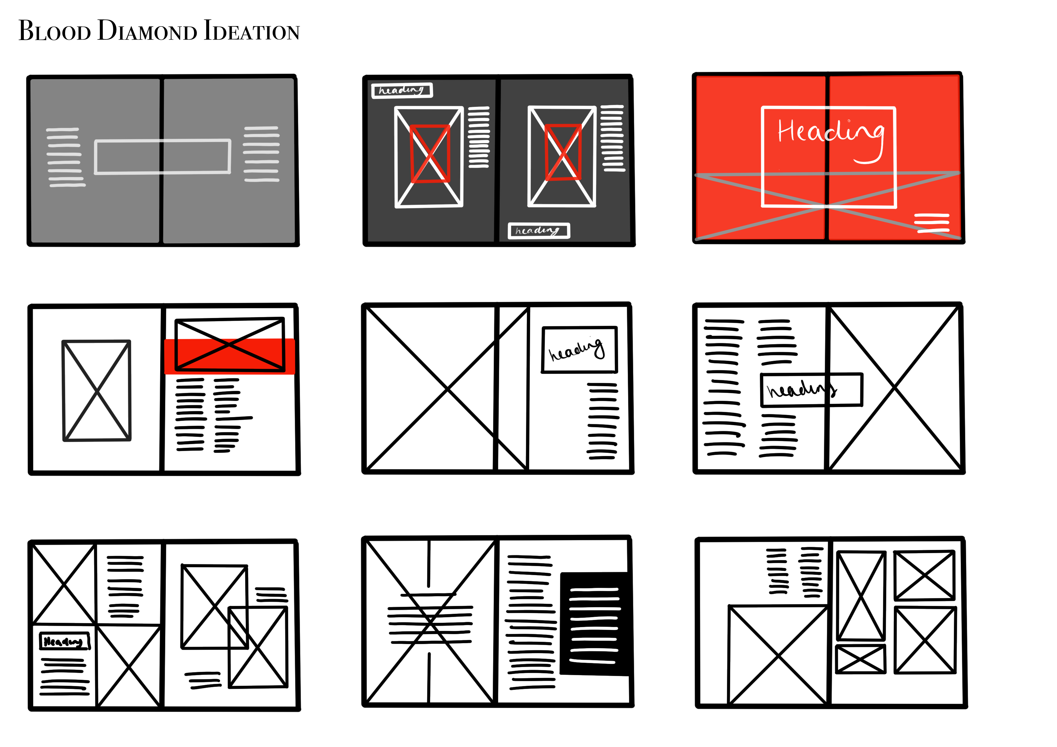
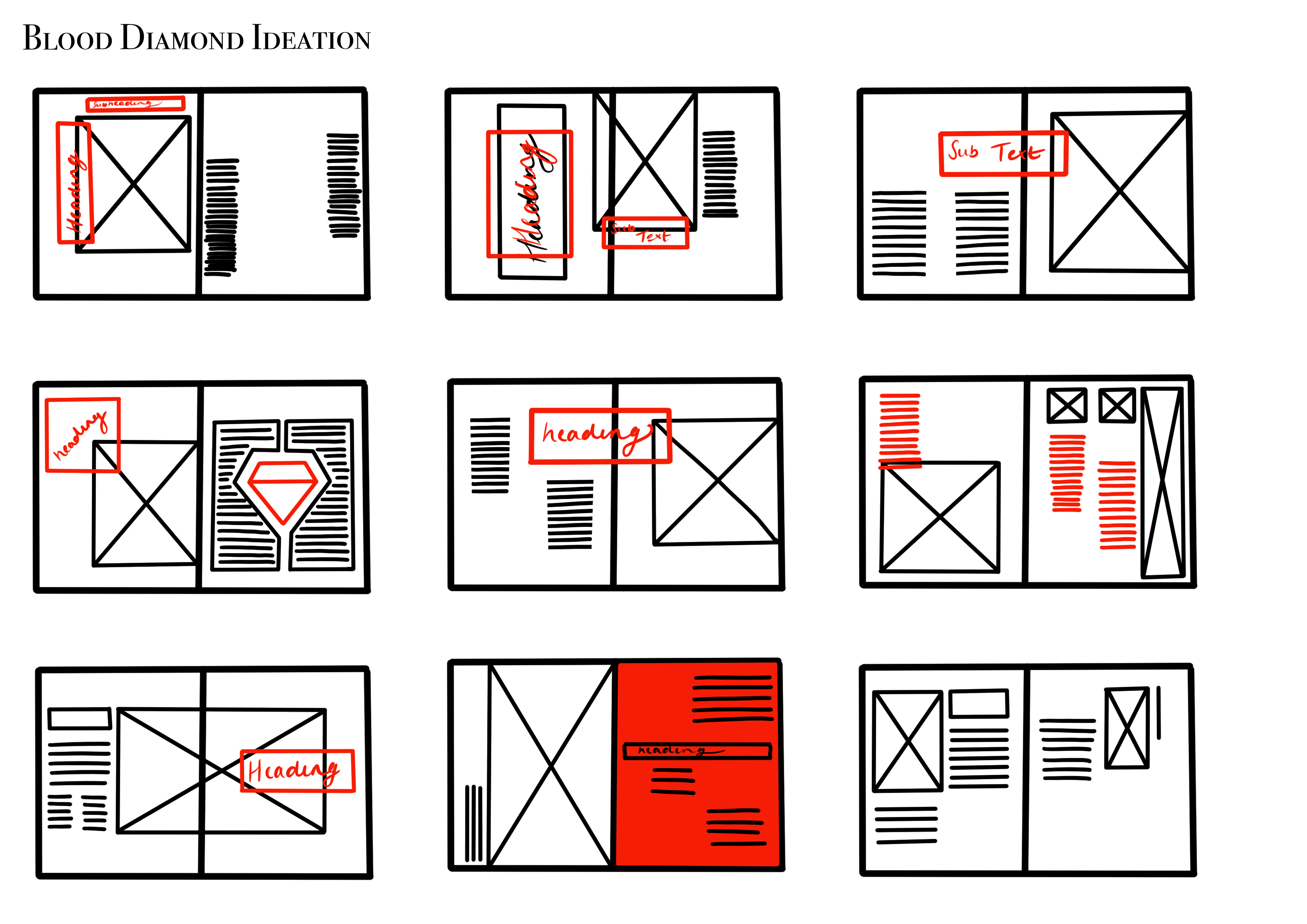
As you can see, I have experimented with a wide variety of layouts, showcasing hierarchy, placements of imagery and body copy and using a limited colour palette to ensure certain aspects do not clash with one another.
Tutoiral with Theo and Carol
Today I had a tutorial with Theo and Carol to discuss what possible theme I wanted to base my criticality on, as mentioned in my previous blog post I wasn’t to sure what I wanted to base it on, so this is what I discussed with Carol and Theo, they also agreed that the Blood Diamond theme is the strongest idea and can have a bigger impact as a project.
I was asked what outcomes I wanted to create for this project and I was thinking of doing Jewelry packaging but placing aspects from the conflict mines from war zones in the bag and also doing a 4-6 page magazine spread that would be placed within luxury magazines. They both liked what outcomes I wanted to produce, they both gave little pointers and advice to help along the way.
Having these tutorials are very useful as they enable yourself to discuss your thought process and design process to other creative individuals and see what they view is on this and also to advise you on what will not work and also what will and how to develop and elevate these ideas even further which is what I would receive in the Graphic Design industry as they would expect the best and creative outcomes to take on through.
Further Development
From my initial ideas, I developed my ideas further, and I thought about using a silhouette of Benjamin Zephaniah and experiment more with placements and typography, after the research I noticed that using a silhouette is quite a common art form used in the Caribbean culture and also relating to Bob Marley.

As this is aimed towards the younger demographic, I decided to use bright colours that relate to the Rasta/Reggae to relate to the Caribbean upbringing.
